Large images can quietly slow down your website and hurt your rankings. If your pages take too long to load, visitors leave—and search engines notice.
Resizing your images properly is one of the simplest ways to improve speed, boost SEO, and create a smoother user experience.
Many beginners upload images straight from a camera or design tool without adjusting the size.
This leads to oversized files, stretched images, and poor performance on mobile devices. The good news is that fixing this is quick and easy once you know the right steps.
Discover smart ways to optimize WordPress images
What Does Resizing Images Mean?
Resizing images means changing their width and height (measured in pixels), so they fit the exact space they are meant to display on your website.
It is different from compressing and cropping, and understanding this difference is key to getting the best results.
Resizing reduces the actual dimensions of the image, while compression reduces the file size without changing dimensions by removing unnecessary data, and cropping cuts out parts of the image to improve framing or focus.
These three actions often work together, but they solve different problems.
Image dimensions directly affect file size because larger images contain more pixels, which means more data for browsers to load; for example, an image that is 4000px wide will be significantly heavier than one resized to 1200px, even if they look similar on screen.
This is why uploading oversized images slows down your website without adding any visual benefit.
You should resize images whenever they are larger than the space they will be displayed in, such as blog images, banners, or thumbnails, or when exporting images from cameras and design tools that default to very high resolutions.
By matching image dimensions to your layout before uploading, you reduce load time, improve performance, and keep your site running efficiently without sacrificing visual quality.
Why Proper Image Resizing Is Important
Faster Page Load Times
Large images take longer to load because they contain more data than needed for display.
When you resize images to match the exact dimensions of your website layout, the browser has less data to download, which speeds up your pages immediately.
Faster loading keeps visitors engaged, reduces bounce rates, and improves overall site performance.
Even a small reduction in image size can make a noticeable difference, especially on pages with multiple images.
Better Core Web Vitals
Core Web Vitals measure how quickly and smoothly your website loads and becomes usable.
Oversized images directly slow down metrics like Largest Contentful Paint (LCP), which tracks how fast the main content appears.
By resizing images before uploading, you help your most important visuals load faster, improving these scores.
Better Core Web Vitals signals to search engines that your site offers a good experience, which can support higher rankings over time.
Improved Mobile Performance
Mobile devices often have slower connections and less processing power than desktops. Large images that might load fine on a computer can cause delays on smartphones.
Properly resized images ensure that mobile users see content quickly without unnecessary waiting.
This creates a smoother browsing experience, keeps users on your site longer, and prevents frustration caused by slow-loading pages.
Reduced Storage and Bandwidth Usage
Every image you upload takes up storage space on your server and uses bandwidth each time it is loaded.
Oversized images quickly add up, especially on content-heavy websites. Resizing images reduces file sizes, which saves storage and lowers bandwidth usage.
This not only improves performance but can also reduce hosting costs and make your website more efficient to run over time.
Choosing the Right Image Dimensions
Understanding Width and Height (Pixels)
Image dimensions are measured in pixels, which define how wide and tall an image appears on a screen.
For example, an image that is 1200 × 800 pixels is 1200 pixels wide and 800 pixels tall. The key is to match these dimensions to the space where the image will be displayed.
If your content area is 800 pixels wide, uploading a 3000-pixel-wide image adds unnecessary weight without improving how it looks.
Always aim to resize images to the maximum display size required—no larger.
Recommended Sizes for Common Use Cases
Use these practical size ranges as a starting point. Adjust slightly based on your theme design.
Blog Post Images
- Recommended width: 800–1200px
- Keeps images sharp while maintaining fast load times
- Ideal for inline content images
Featured Images
- Recommended size: 1200 × 630px
- Works well for social sharing and blog previews
- Maintains a consistent look across posts
Thumbnails
- Recommended size: 150 × 150px to 300 × 300px
- Small and lightweight for listings or sidebars
- Helps pages load faster when multiple images are shown
Full-Width Banners
- Recommended width: 1600–2000px
- Ensures sharp display on large screens
- Avoid going beyond 2000px unless necessary
Matching Image Size to Your Theme Layout
Your theme controls how wide images appear on your site, so always check your layout before resizing.
Open a page, inspect the content width, and use that as your maximum image width. This prevents uploading oversized images that get scaled down by the browser.
When in doubt, resize slightly above your content width (for example, 1200px for an 800px container) to keep images sharp on high-resolution screens.
This approach balances quality and performance while keeping your site visually consistent.
Best Image Formats for Resizing
JPEG vs PNG vs WebP vs AVIF
JPEG (JPG)
- Best for photos and complex images
- Uses lossy compression to reduce file size
- Smaller files, but slight quality loss
- Widely supported across all browsers
PNG
- Best for graphics, logos, and images needing transparency
- Uses lossless compression (no quality loss)
- Larger file sizes compared to JPEG
- Ideal when image clarity is more important than size
WebP
- Modern format with better compression than JPEG and PNG
- Supports both lossy and lossless compression
- Smaller file sizes with high quality
- Supported by most modern browsers
AVIF
- Newer format with even better compression than WebP
- Delivers very small file sizes with excellent quality
- Supports transparency and advanced features
- Slightly slower to process and not fully supported everywhere
When to Use Each Format
- Use JPEG for standard photos where a small file size matters
- Use PNG for logos, icons, and images that need transparency
- Use WebP for most website images to balance quality and performance
- Use AVIF when you want the smallest possible file size, and your site supports it
For most websites today, WebP is the safest default, with AVIF as an advanced option.
How Format Affects Resizing and Quality
Resizing reduces image dimensions, but the format determines how well the image holds its quality after resizing.
JPEG images may lose some detail if compressed too much, especially after resizing. PNG keeps full quality, but it can result in large files even after resizing.
WebP and AVIF handle resizing more efficiently by keeping high visual quality at much smaller file sizes.
The best approach is simple: resize your image first to the correct dimensions, then export it in a modern format like WebP or AVIF.
This ensures your images look sharp while staying lightweight and fast to load.
How to Resize Images (Step-by-Step)
Resizing images is simple once you follow the right process.
Below are three beginner-friendly methods you can use depending on your tools and workflow.
Method 1: Using Free Online Tools (Canva, TinyPNG, ResizeImage)
Online tools are the easiest option if you want a quick solution without installing software. They are designed for beginners and require no technical skills.
Step-by-step process:
- Upload your image to a tool like Canva or ResizeImage
- Enter your desired width and height in pixels
- Adjust the image to fit the canvas if needed
- Download the resized image in your chosen format (JPG or PNG)
- (Optional) Upload the image to TinyPNG to reduce the file size further
Tools like Canva allow you to set custom dimensions before downloading, while TinyPNG focuses on compressing images without visible quality loss.
This combination gives you properly sized and lightweight images in minutes.
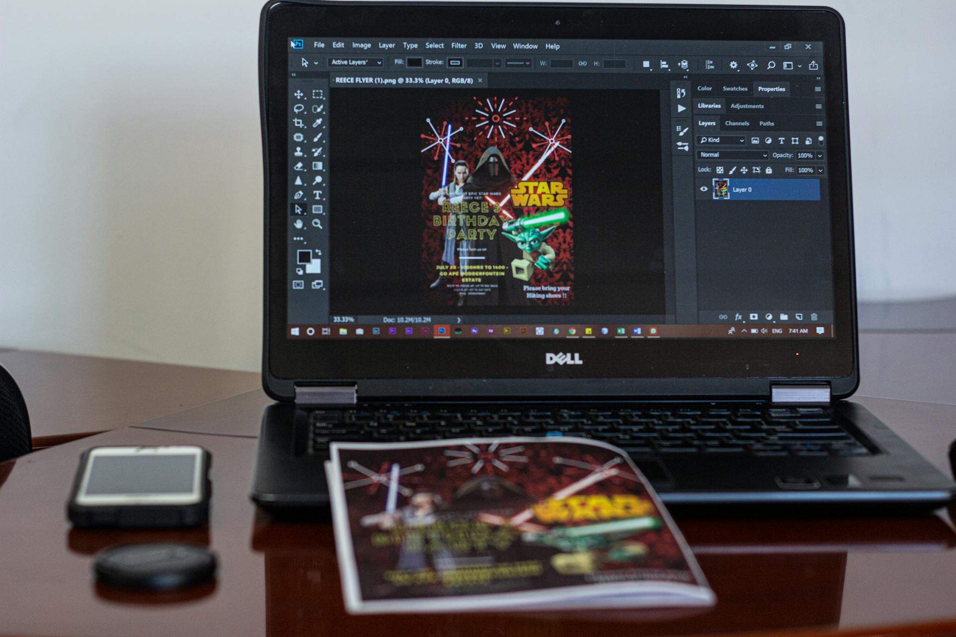
Method 2: Using Desktop Software (Photoshop / GIMP)
Desktop software gives you more control and better precision, making it ideal for consistent, high-quality results.
Step-by-step process:
- Open your image in Photoshop or GIMP
- Go to Image → Image Size (Photoshop) or Image → Scale Image (GIMP)
- Enter your desired width or height
- Enable “Constrain Proportions” (or link icon) to maintain aspect ratio
- Apply the changes and confirm
Maintaining aspect ratio ensures your image does not stretch or distort during resizing.
Export settings for web:
- Choose JPEG for photos or PNG for graphics
- Adjust quality (around 70–90% for JPEG) to balance size and clarity
- Use Export or Save for Web to optimize file size
- Stick to sRGB color profile for consistent display online
This method gives you full control over both dimensions and the final file size.
Method 3: Using WordPress
WordPress offers built-in tools, but they work best when combined with proper resizing before upload.
Built-in image resizing:
- WordPress automatically creates multiple image sizes (thumbnail, medium, large) when you upload an image
- These versions are used across your site to improve performance
Media settings:
- Go to Settings → Media in your dashboard
- Set default sizes for thumbnails, medium, and large images
- WordPress will generate these sizes automatically on upload
Cropping inside the editor:
- Open an image in the Media Library
- Click Edit Image
- Use the crop tool or manually adjust dimensions
- Save changes
While WordPress can resize images, uploading large originals still affects performance.
For best results, resize images before uploading, then let WordPress handle additional scaling and display versions
Maintaining Image Quality While Resizing
Keep Aspect Ratio Consistent
Aspect ratio is the relationship between an image’s width and height, and keeping it consistent prevents distortion.
When resizing, always lock the aspect ratio (often shown as a chain/link icon in tools) so the image scales proportionally.
If you change width and height independently, the image will stretch or squash, making it look unnatural and unprofessional.
A simple rule is to adjust only one dimension and let the tool automatically calculate the other.
Avoid Upscaling Images
Upscaling means increasing the size of an image beyond its original dimensions.
This reduces quality because the software has to “guess” and create extra pixels that were never there.
The result is a blurry or pixelated image. Always start with a high-resolution source and scale down to the size you need.
If an image is too small for your layout, it is better to replace it with a higher-quality version than to enlarge it.
Use Proper Interpolation Methods
Interpolation controls how pixels are adjusted when an image is resized. Most tools offer options like “Bicubic,” “Bilinear,” or “Nearest Neighbor.”
For best results, use Bicubic (or Bicubic Sharper for reducing size) when downsizing images, as it preserves detail and smoothness.
Avoid basic methods like Nearest Neighbor for photos, as they can produce rough edges.
Optimize After Resizing
Resizing reduces dimensions, but optimization reduces file size further without hurting visual quality.
After resizing, run your image through a compression tool or export it using optimized settings (such as 70–90% quality for JPEG or modern formats like WebP).
This step removes unnecessary data and ensures the image loads quickly.
Combining resizing and optimization gives you the best balance between sharp visuals and fast performance.
Best Practices for Web Optimization
- Resize before uploading – Always adjust image dimensions to match your layout before uploading to avoid unnecessary file size and improve load speed.
- Use responsive images (srcset) – Serve different image sizes for different screen sizes so users get the most appropriate version for their device.
- Combine resizing with compression – Resize first, then compress the image to reduce file size further without noticeable quality loss.
- Lazy loading images – Load images only when they are about to appear on the screen, which speeds up initial page load time.
Common Mistakes to Avoid
Uploading Oversized Images
Uploading images that are much larger than needed is one of the most common mistakes.
Many images come straight from cameras or design tools at sizes like 3000px or more, even though your website may only display them at 800–1200px.
This adds unnecessary weight, slows down your pages, and wastes bandwidth. Always resize images to match your layout before uploading to keep your site fast and efficient.
Stretching or Distorting Images
Images become distorted when width and height are changed independently without maintaining the original proportions.
This results in stretched faces, squashed objects, and an unprofessional look. Always lock the aspect ratio when resizing so the image scales correctly.
If the image does not fit your layout, crop it instead of forcing it to stretch.
Using the Wrong File Format
Choosing the wrong format can lead to either poor quality or unnecessarily large files.
For example, using PNG for large photos increases file size without benefit, while using JPEG for graphics can reduce clarity.
Match the format to the image type: use JPEG for photos, PNG for graphics with transparency, and modern formats like WebP for better performance.
Ignoring Mobile Dimensions
Designing only for desktop screens can cause problems on mobile devices. Large images may load slowly or appear too big on smaller screens, affecting user experience.
Always consider how images will look and perform on mobile. Using properly resized images and responsive techniques ensures your site loads quickly and looks clean on all devices.
Recommended Tools for Image Resizing
Free Tools
These tools are simple, fast, and require no installation.
- Canva – Lets you quickly resize images by setting custom dimensions before downloading, making it ideal for beginners and social media graphics
- TinyPNG – Compresses and converts images (JPEG, PNG, WebP, AVIF) while reducing file size significantly with minimal visible quality loss
- ResizeImage / Pixlr – Basic online editors that allow you to manually set width and height, crop, and export images for web use
These are best for quick edits and small batches of images.
Paid Tools
Paid tools offer more control, better quality handling, and advanced features.
- Adobe Photoshop – Industry-standard tool with precise resizing, advanced interpolation, and “Save for Web” export options for full control over quality and file size
- Adobe Lightroom – Great for batch resizing and exporting multiple images with consistent settings, especially useful for photographers
- Canva Pro – Adds bulk resizing, brand kits, and export flexibility for faster workflows
These tools are ideal if you regularly work with images or need consistent, high-quality results.
WordPress Plugins
Plugins automate resizing and optimization directly on your website.
- Imagify – Offers automatic compression, resizing, and WebP conversion with different optimization levels
- Smush – Popular plugin that compresses images on upload and supports bulk optimization for existing images
- EWWW Image Optimizer – Provides advanced optimization options, including bulk resizing and server-side processing
- ShortPixel – Automatically compresses and resizes images with both lossy and lossless options
These plugins are best for saving time and keeping your site optimized without manual work.
Simple recommendation: Use free tools for quick edits, paid tools for precision and bulk work, and WordPress plugins for automation.
Final Thoughts
Resizing images properly is one of the easiest ways to improve your website’s speed, performance, and user experience.
By choosing the right dimensions, using the correct format, and avoiding common mistakes, you keep your images sharp while reducing load time.
Always resize images before uploading, then compress and optimize them for the web. Use reliable tools and modern formats like WebP to get the best results with less effort.
Small changes here make a big difference across your entire site.
Want to go further? Master image optimization in WordPress
FAQs
What is the best size for website images?
It depends on your layout, but most content images work well between 800–1200px wide.
Can I resize images without losing quality?
Yes, if you reduce the size (not enlarge) and keep the aspect ratio, the quality will remain sharp.
Should I resize images before uploading to WordPress?
Yes, resizing before upload improves speed and prevents unnecessarily large files on your site.
What happens if I upload large images?
Your pages will load slower, use more bandwidth, and may hurt SEO and user experience.
Is resizing the same as compressing?
No, resizing changes image dimensions, while compression reduces file size without changing dimensions.

Hi, I’m Daniel Cacheton. I specialize in WordPress performance optimization and have spent 7+ years improving site speed, Core Web Vitals, and overall user experience. I share practical, no-fluff guides based on real testing to help you build faster WordPress websites.
")